Lumie
SUMMARY
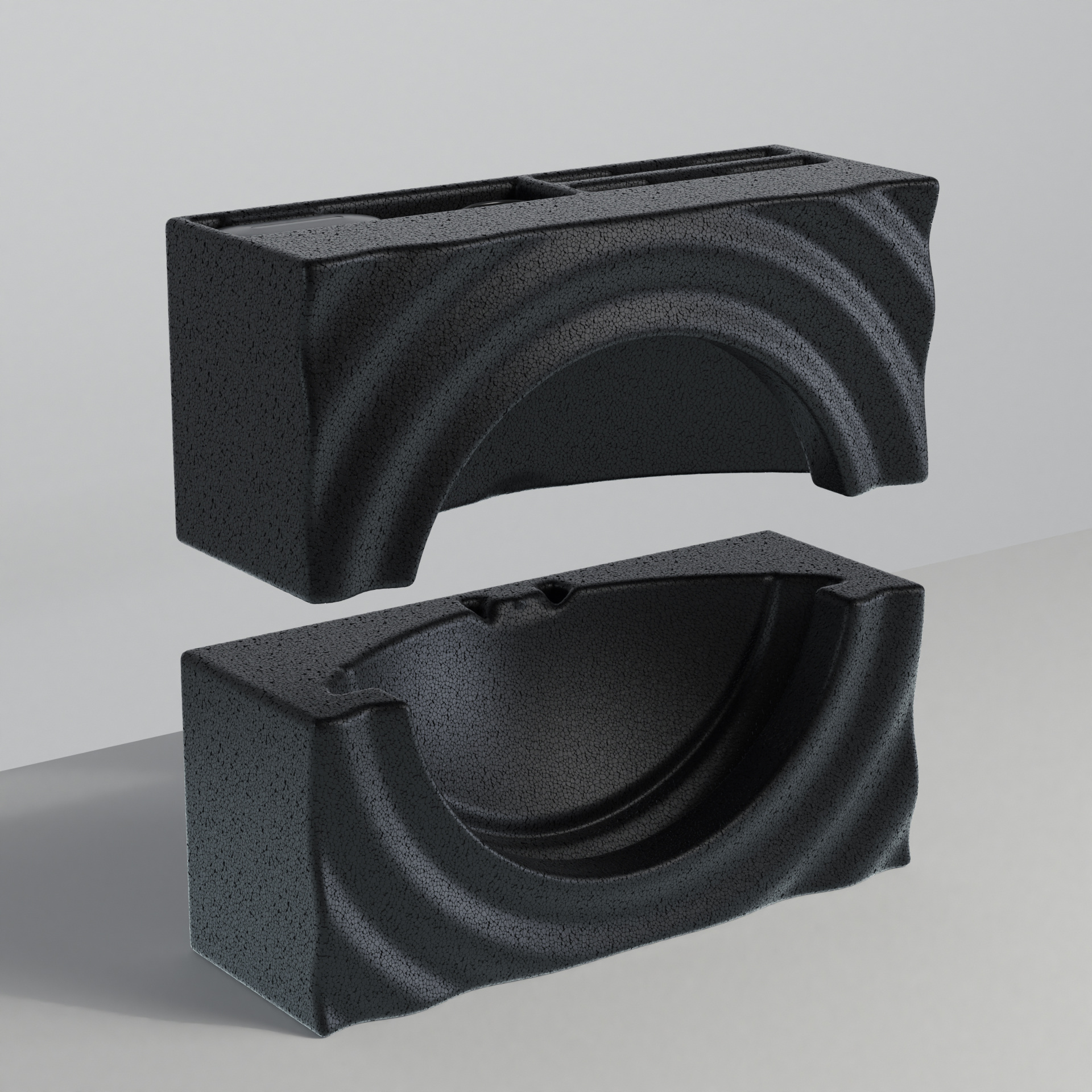
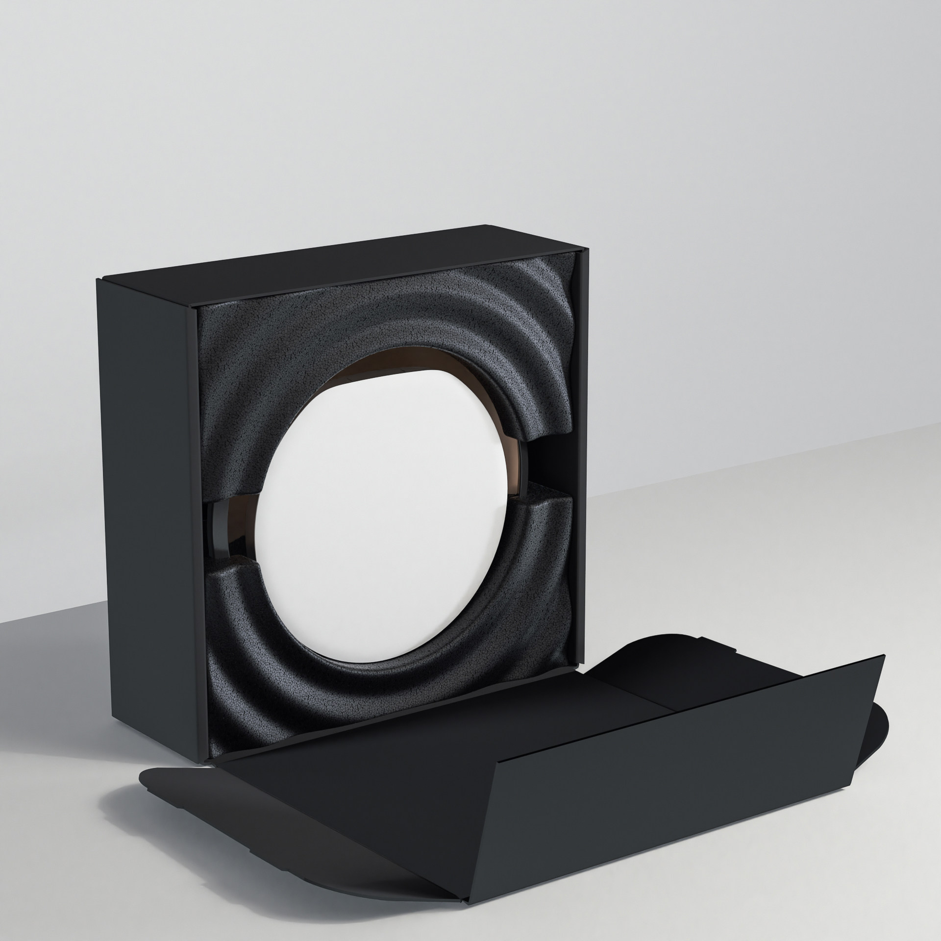
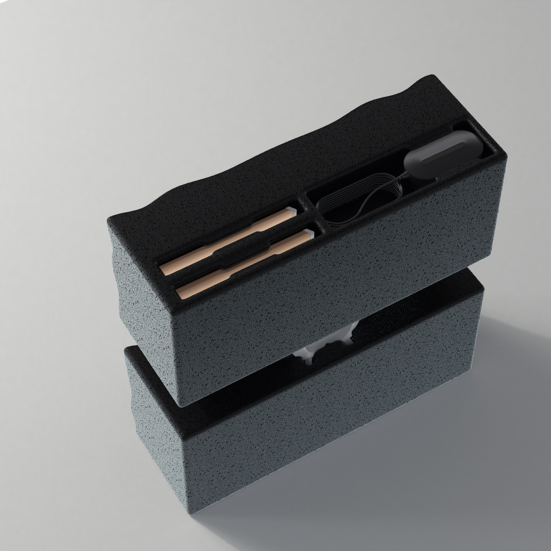
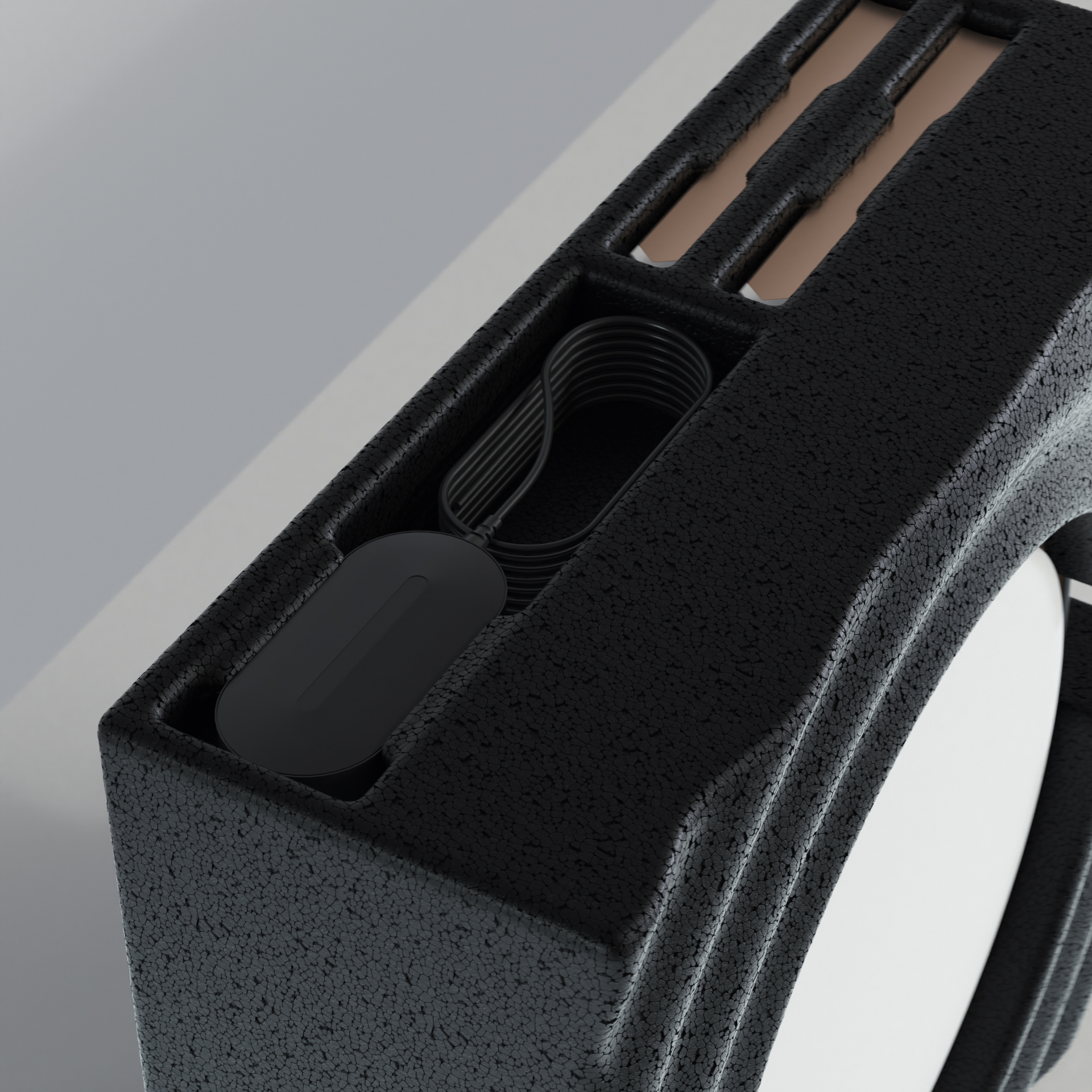
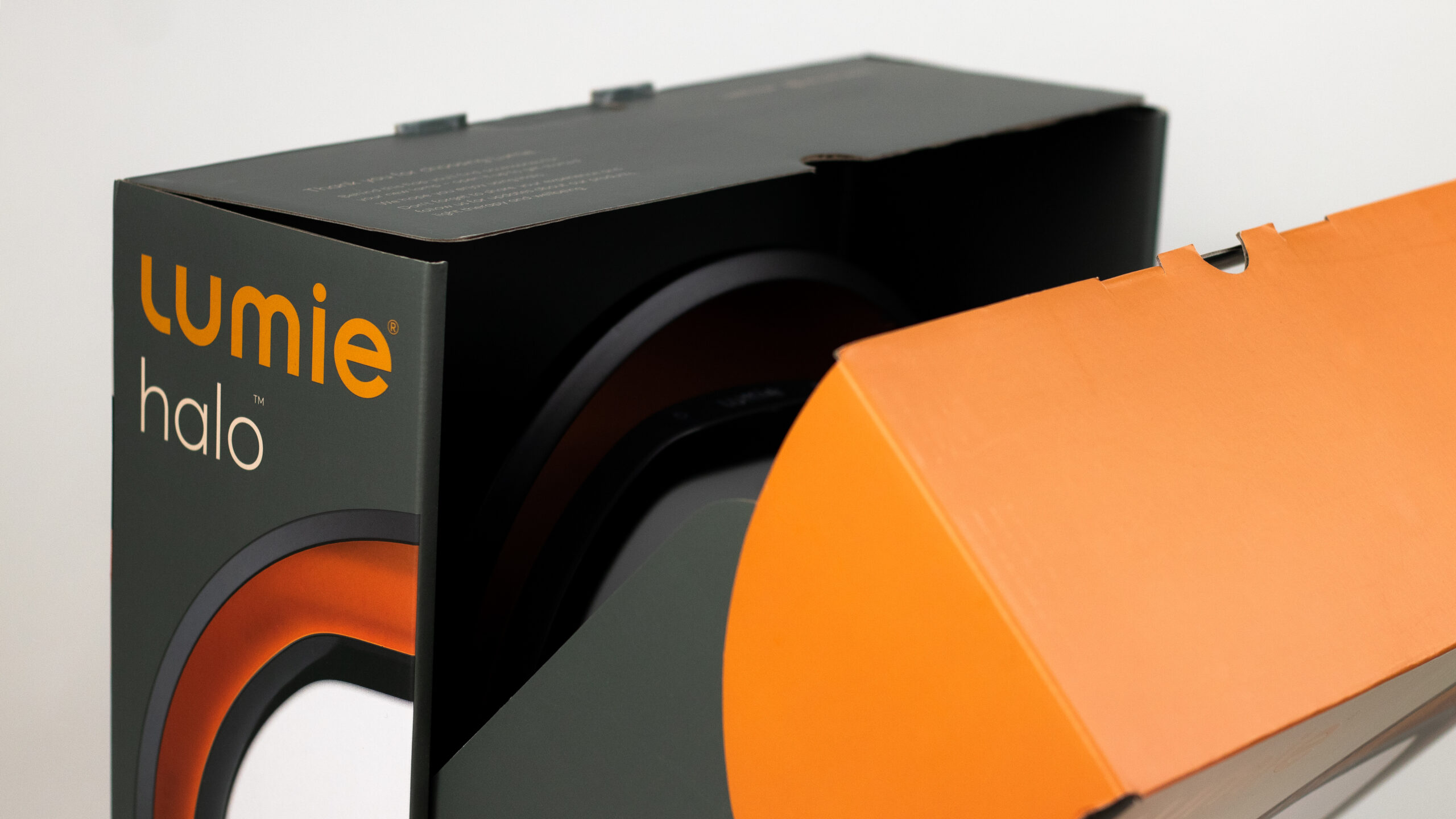
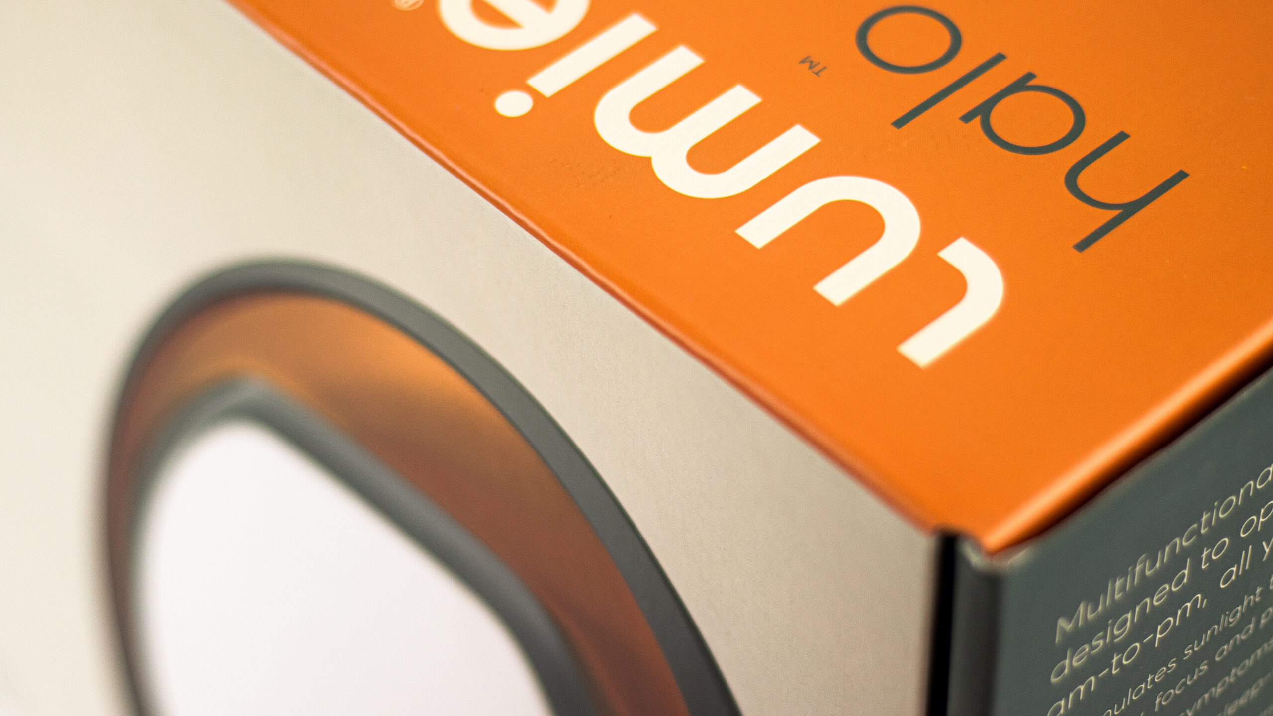
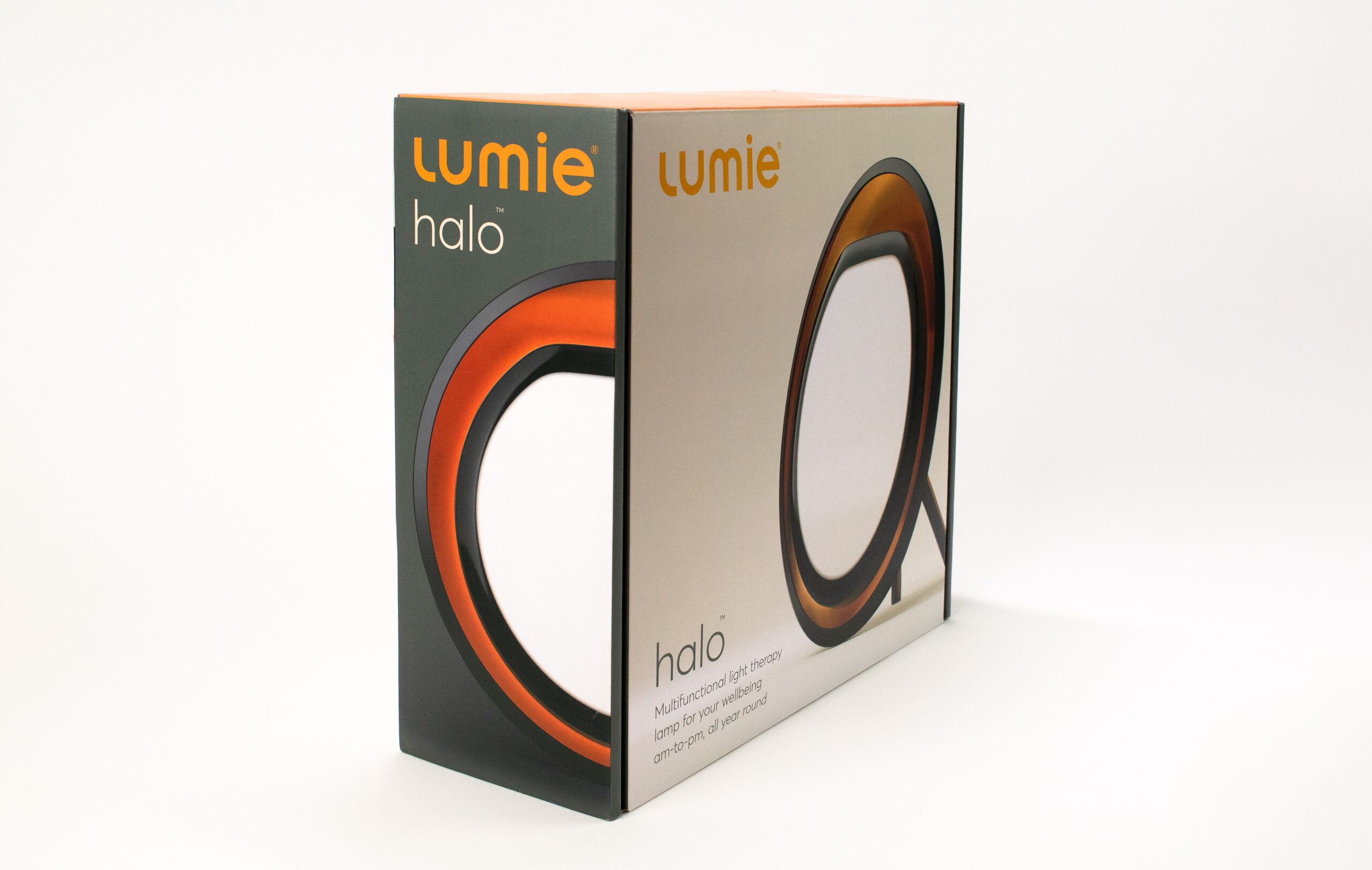
Lumie is an English company with over 30 years of experience in creating health lamps. We had the pleasure of working with the team and refreshing their visual identity and designing the packaging experience for stylish and the advanced lamp - HALO.
SCOPE OF WORK
Communication Strategy
Research & test
Visual Identity
Webdesign
Packaging
Augmented Reality
Landing pages
B2B Deck
3D Animations
Marketing materials
BRAND
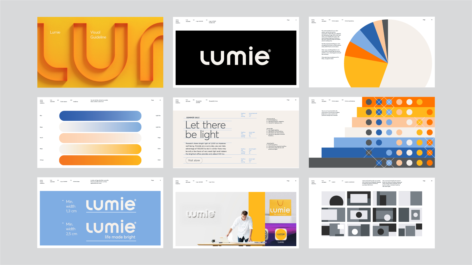
The main inspiration for the brand was how the temperature of the light dictates our life. Blue light gives energy, while yellow light calms. We wanted to focus on the round shapes, bring more colors to the identity, and let the light and shadow play the leading roles.
FONT
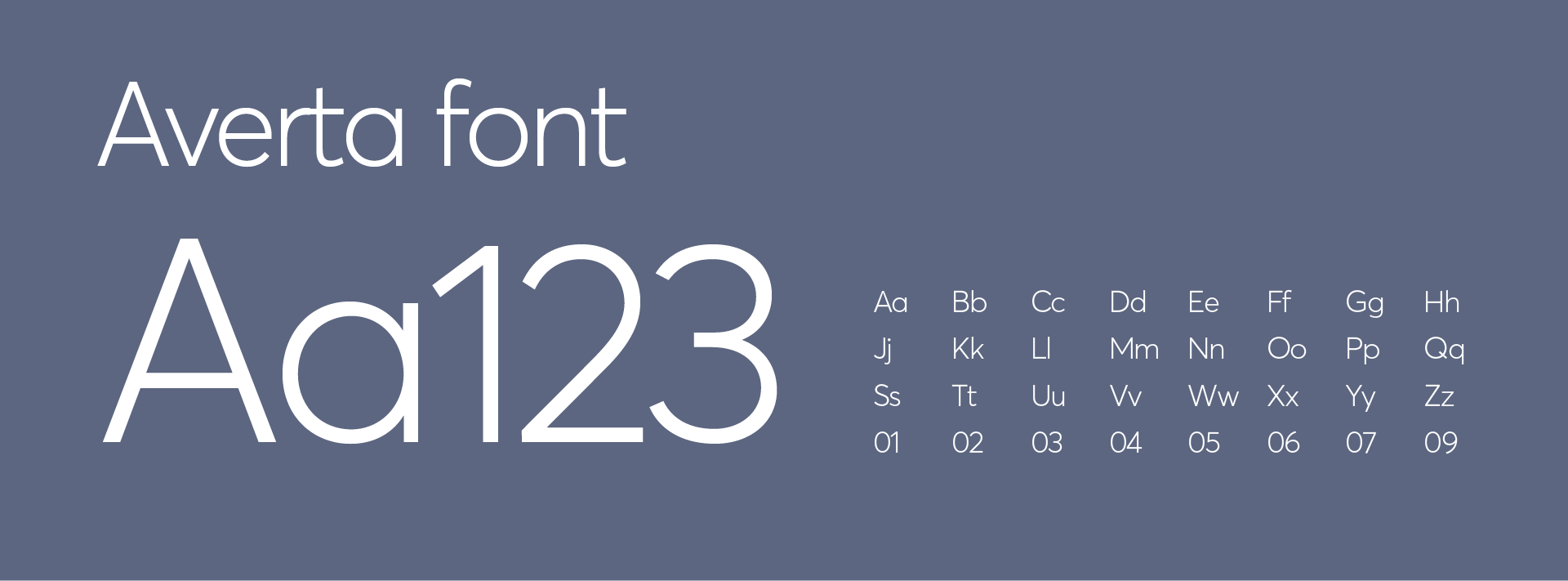
Helvetica is classy, universal, and always looks good, but the same time is generic and gives no character to the brand. We want to change that. Averta font is geometric with rounded lower parts and dots above “i”, just like the Lumie logo. It contains and a vast range of characters and languages.
3D VISUALS
Due to short deadline and high quality demand, we decided to use real-time game engine - Unreal. The engine gave us physically correct values of the light temperature in different modes, but the most importand was that we had possibilty to produce fourteen 8K resolution shots of the product in just one day.
AGUMENTED REALITY
More realistic expectations, more purchases, less disappointments, less returns.
Augmented reality lamp for Lumie was the perfect way to showcase new beautiful product.
Get in Touch!
Let’s start bringing your vision to life today.

