Only smoke FIRE
SUMMARY
Fire is the new brand on cannabis map in Los Angeles. Tato Studio was commissioned to define the entire brand, from identity to packaging to web and digital presence.
SCOPE OF WORK
Visual Identity
Webdesign
Packaging
3D Animations
Marketing materials

BRAND
The brief was relatively simple. The client wanted the brand to stand out from the competition, be robust, urban, and visually elegant at the same time. We decided to use the logotype as a symbol, a monochrome palette, and a modern but straightforward font character. We chose to use holographic foil as the main distinguishing feature of products and brands. Different shades of the reflective foil served as a separation of the flavors and variants of the pre-rolls.




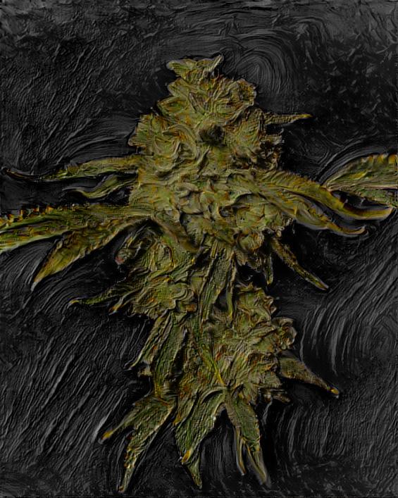
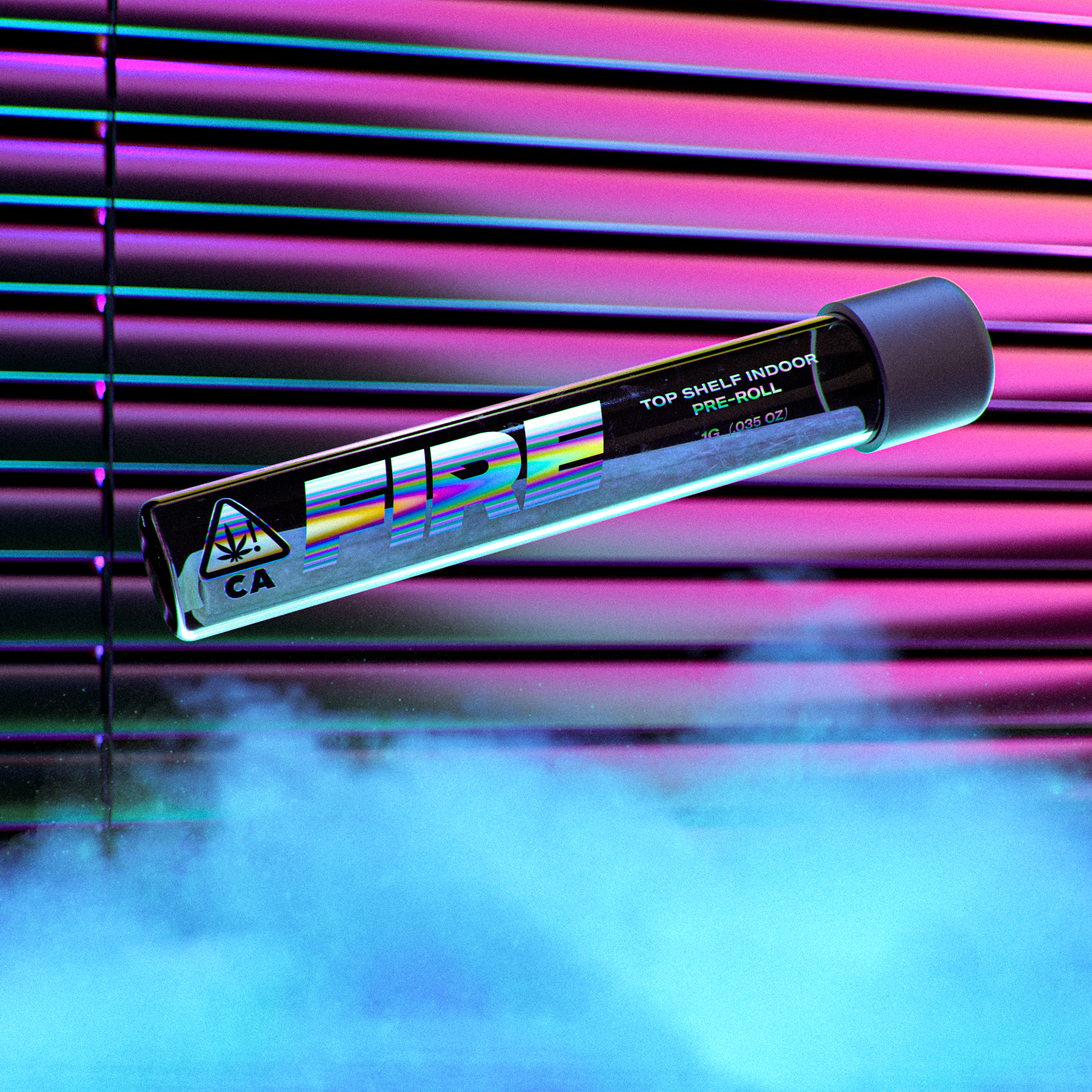
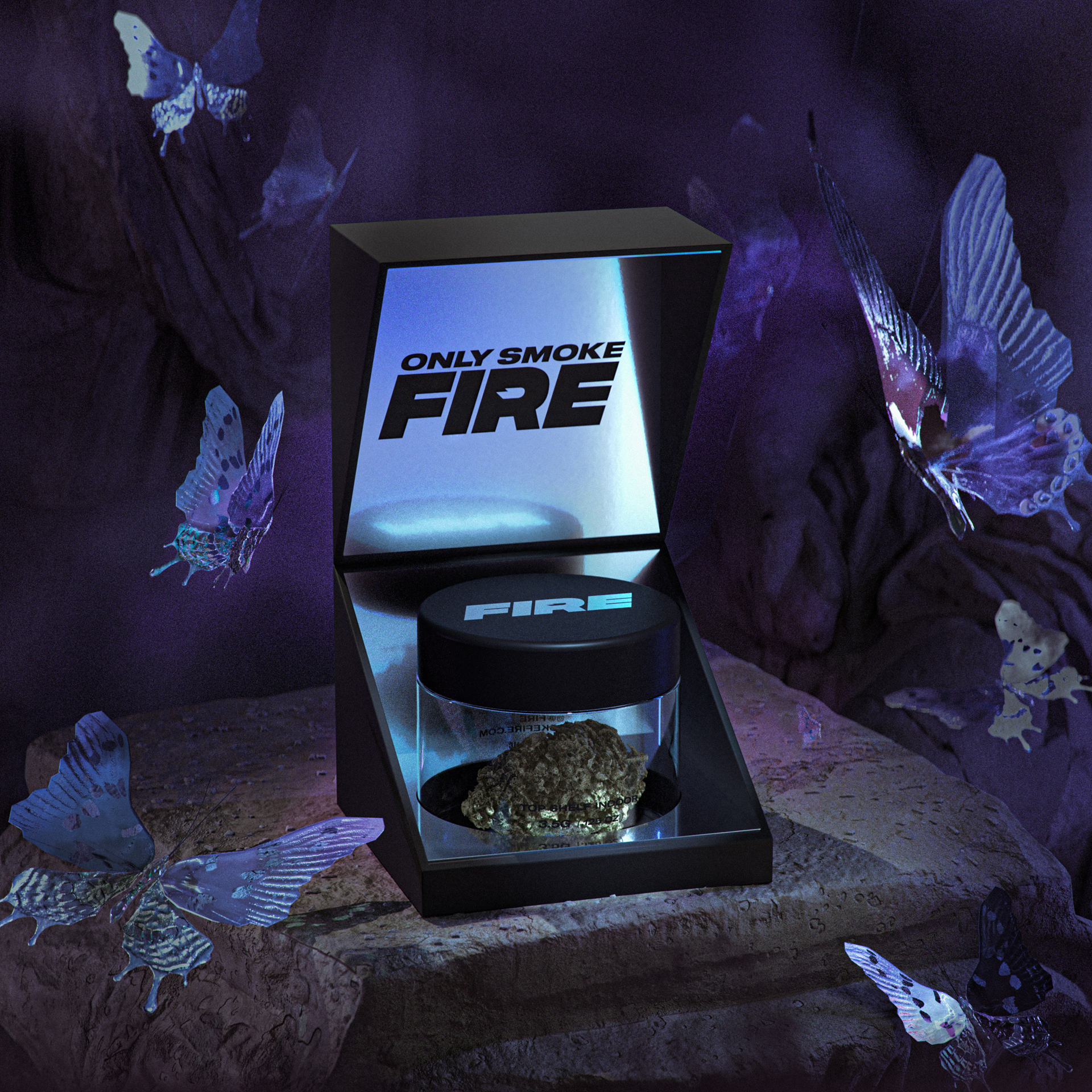




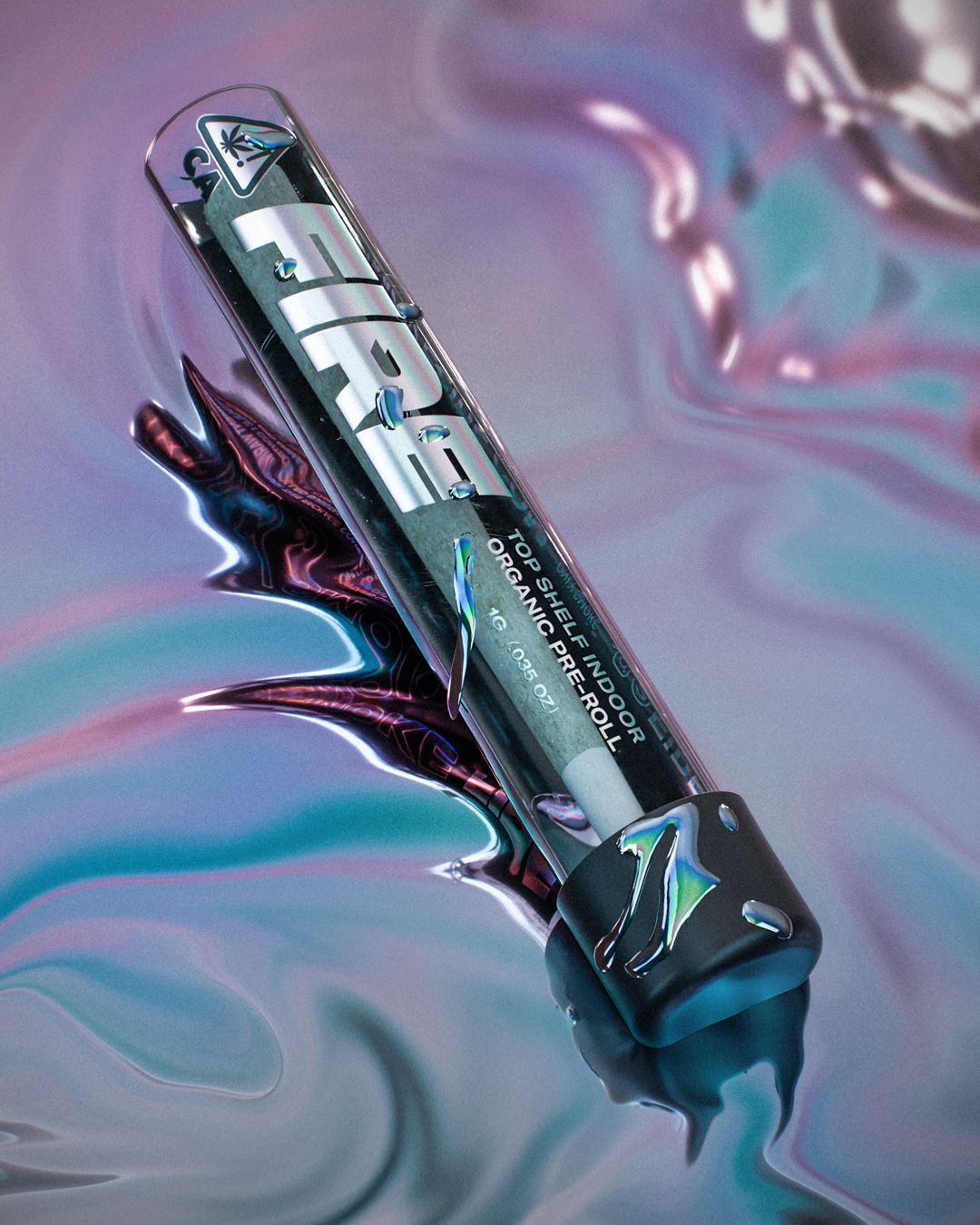
We marked the brand's presence on the internet by creating short 3D animations representing the following sections: store, collections, and genetics. We decided to show spaces that corresponded to the adopted assumptions. Thanks to the Unreal Engine, we were able to use a large amount of geometry and animate the characters quickly.
Get in Touch!
Let’s start bringing your vision to life today.


